
Summary: A marginal abatement cost curve ranks emission reduction measures from cheapest to most expensive, expressed in cost per tonne of CO2 avoided. It helps policymakers and companies prioritise low-cost actions first, then plan for harder, costlier options. When compared against carbon prices, it signals whether to invest in abatement or purchase allowances.
How do you decide which tonne of carbon to cut first when hundreds of technologies compete for the same budget? The answer often begins with a single chart. Our overview of emission abatement shows that not every reduction costs the same, and that ordering matters enormously. A marginal abatement cost curve turns a sprawling list of options into a ranked, budget-aware plan.
This tool arranges each measure by its incremental cost per tonne of CO2, from money-saving actions to expensive last-mile technologies. For industrial operators, banks, and traders exposed to carbon pricing, understanding the cost of reducing emissions is now central to strategy. In 2026, with tighter caps and evolving policy, reading this curve correctly can shape multi-year capital decisions.
What a marginal abatement cost curve actually shows
At its core, the marginal abatement curve plots two variables. The vertical axis measures the cost of abating one additional tonne of CO2 equivalent, usually in euros or dollars per tonne. The horizontal axis measures the volume of emissions each measure can remove per year. Each action appears as a block, and the blocks are ordered from cheapest on the left to most expensive on the right.
The width of each block reveals its reduction potential, while its height reveals its marginal abatement cost. Actions sitting below the zero line save money while cutting emissions, the so-called no-regret moves such as basic energy efficiency. Actions above the line carry a net cost. The metric of choice is dollars or euros per tonne of CO2 equivalent, written as $/tCO2e.

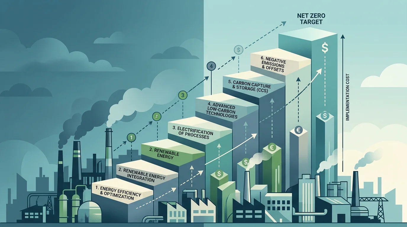
This structure explains why the curve slopes upward. Early reductions are typically the low-hanging fruit, cheap and readily available with existing technology. As those options run out, the cost of each further tonne escalates, pushing decision-makers toward alternative technologies or harder sectors.
From McKinsey to net-zero: how the tool evolved
The concept became mainstream through a widely circulated version. According to the Environmental Defense Fund, the traditional cost curve popularised by McKinsey & Company in 2007 carried notable limitations, because it examined a single measure at a single moment and could not show how technologies interact or how to sequence investment over time.
Newer approaches attempt to fix this. The same organisation describes a revamped curve that maps annual reductions across the energy system and offers insight on timing and sequencing across three decades. In their modelling, measures in the roughly $0 to $60 per tonne range, largely clean electricity and transport, deliver a substantial share of the path toward net-zero, while options such as direct air capture only become relevant at costs exceeding $180 per tonne.
The practical takeaway is that a curve is only as good as its assumptions. Different models produce very different cost estimates for the same technology, so treating any single chart as definitive is a mistake. If you want to understand the market mechanics behind these numbers, our explanation of how cap-and-trade works provides the regulatory backdrop.
Why the curve matters for carbon pricing and the EU ETS
The curve is not just an engineering exercise; it is deeply tied to the price of carbon. In a market such as the EU Emissions Trading System, companies must surrender one allowance for every tonne they emit. The logic is direct: once the carbon price rises above the marginal abatement cost of a given technology, investing in that technology becomes more rational than buying allowances.
Prices have climbed to levels that make this trade-off real. According to the European Commission, EU ETS prices fluctuated between EUR 60 and EUR 80 during 2025, and from 2026 the Carbon Border Adjustment Mechanism gradually replaces free allocation as the main tool against carbon leakage. As free allowances phase out, the effective cost signal on the curve strengthens for exposed industries.
For operators weighing capital projects, the emissions trading framework converts abstract policy into a hard financial line. Our analysis of the emissions trading system in support of low-carbon transition explains how this pricing pressure is designed to rise over time and pull new abatement options into the money.
Reading the curve against live allowance prices in 2026
Consider a cement plant evaluating carbon capture at an abatement cost around €120 per tonne. Whether it invests depends entirely on where allowance prices sit and where they are heading. That comparison, abatement cost versus expected allowance price, is the single most important decision the curve supports.

Recent market data gives that comparison context. Reporting from euenergy put the average EUA price at €72 per tonne in April 2026, a level that already tips many efficiency and fuel-switching measures below the allowance cost. Forecasts suggest further tightening. In a 2026 outlook, ABN AMRO projected an average EUA price of 82 EUR per tonne for 2026 and a long-term baseline of 138 EUR per tonne by 2030.
These trajectories reshape the curve in practice. As prices climb toward those levels, measures that looked uneconomic today move below the price line, unlocking further reductions. This is precisely why carbon pricing is designed to appreciate: rising prices continuously convert previously expensive abatement into competitive investment.
How companies and traders use the curve in practice
The decision framework is simpler than the modelling behind it. Comparing a measure's marginal cost to the prevailing allowance price yields three broad outcomes for any exposed business.
| Situation | Typical action | Rationale |
|---|---|---|
| Abatement cost below allowance price | Invest in reduction | Creates long-term value and cuts exposure to price volatility |
| Abatement cost above price but strategic | Phased or hybrid approach | Partial abatement plus allowance purchase de-risks future price rises |
| Abatement cost far above price, non-strategic | Purchase allowances short term | Cheaper now, but monitor the gap as the cap tightens |
Executing that framework requires reliable market access and live pricing. This is where our platform fits: we provide real-time price monitoring, configurable alerts, and pre-trade risk controls so that carbon exposure can be managed alongside abatement planning. Our trading in EU Allowances lets professional participants act on the curve rather than merely study it.
The curve, then, becomes a living instrument. Paired with current and forward allowance prices under low, central, and high scenarios, it lets an operator or trader stress-test whether to build, buy, or wait, and to revisit the answer as market conditions change.
Turning the curve into decisions
The marginal abatement cost curve remains one of the clearest ways to translate the messy reality of decarbonisation into ranked, cost-aware choices. Its power lies not in precision but in discipline: it forces you to cut the cheapest tonnes first, sequence harder options, and test every measure against a moving carbon price. Treat any single curve as a scenario, not a forecast, refresh it as allowance prices evolve, and pair it with live market data. Used that way, it becomes a genuine bridge between climate targets and capital allocation.
Take action with Initiativ
Reading the curve is only half the challenge; acting on it requires fast, transparent access to the carbon market. If you are an industrial operator, bank, trading firm, or asset manager weighing abatement against allowance costs, you need execution that matches your analysis in real time.

We are a programmable exchange for trading EU carbon allowances, where trade sizes start from a single EUA rather than traditional 1,000-lot blocks. With competitive fees, transparent live pricing, configurable alerts, pre-trade risk controls, and API access, you can align your carbon positions with your abatement strategy. Get access today to our demo environment and see how professional-grade tools support smarter carbon decisions.
Frequently Asked Questions
What is a marginal abatement cost curve in simple terms?
It is a chart that ranks emission reduction measures from cheapest to most expensive per tonne of CO2 avoided. The width of each block shows how much it can reduce, and the height shows its cost. Reading left to right reveals which actions to prioritise.
Why do abatement costs increase along the curve?
The cheapest, easiest measures, often energy efficiency, get used first. Once these low-hanging options are exhausted, further reductions rely on costlier technologies or harder-to-decarbonise sectors. This escalation is what gives the curve its upward slope.
How does the curve relate to the carbon price?
When the carbon price exceeds the marginal abatement cost of a technology, investing in that technology becomes cheaper than buying allowances. As prices rise over time, more measures fall below the price line. This gradually pulls new abatement options into economic viability.
Can I use the curve to decide between abating and buying allowances?
Yes, that comparison is one of its main uses. If a measure costs less per tonne than the expected allowance price, reduction usually creates more value. Our real-time price monitoring and pre-trade risk controls help you run that comparison against live market data.
Are marginal abatement curves always accurate?
No, they depend heavily on assumptions about technology costs and timing. Different models can produce very different estimates for the same measure. Treat any curve as a scenario to be updated regularly rather than a fixed forecast.